
Force Byte
How to create Charts in Excel (1)
In our daily work, we are often confronted with a lot of data. Only viewing the figures, it is not easy for us to tell the fact and their interrelations behind. Thankfully, a chart, though a simple one, can show us information at a glance. From this issue onwards, we will see how to create simple but practical charts in Excel.
You may not be aware that Excel offers 14 types of charts for you to choose from. They include Column, Bar, Line, Pie, XY (Scatter), Area, Doughnut, Radar, Surface, Bubble, Stock, Cylinder, Cone and Pyramid.
All charts can usually be applied into different situations. However, the column chart and the line chart are particularly good at illustrating any data changes over a period of time. For example, the change of HK crime rates in years. From the chart, we can discover whether the number of crimes in Hong Kong is increasing or decreasing in recent years. Another chart type, the pie chart, works best in comparing differences among data, say, the crime rates in various districts in a year. To let you start easily, I will pick the most simple column chart to demonstrate how charts are created in Excel.
Let's first download the worksheet of "Overall Crime Statistics" from the Force Homepage (http://www.info.gov.hk/police/hkp-home/english/statistics/download.htm) into "c:\TEMP" and then open it in Excel. Afterward, select the English edition of the report by clicking the "Eng" tab at the bottom of the worksheet window (See Figure 1).
Highlight the "Overall Crime" figures of two years in the cell range of B4:D6, which also contains titles and data (See Figure 2).
Click the "Chart Wizard" button on the toolbar. In the "Chart Wizard - Step 1 of 4 - Chart Type" dialogue box (See Figure 3), select "Column" and use the default Chart Sub-type, and then click "Next".
With the data range already selected in Figure 2, go on to click "Next" in the "Chart Wizard - Step 2 of 4 - Chart Type" dialogue box (See Figure 4).
In the "Chart Wizard - Step 3 of 4 - Chart Type" dialogue box, there are tags like "Titles", "Axes", "Gridlines", "Legend", "Data Labels" and "Data Table", I will choose some of them to discuss their functions in details later. At this moment, we just need to input "Comparison of 2003 (Jan - Oct) and 2002 (Jan - Oct) Crime Situation" in the "Chart type" box, "Year" in the "Category (X) axis" box and "No of Case" in the "Value (Y) axis" box, under the "Title" tag (See Figure 5). After then, just click "Next".
In the "Chart Wizard - Step 4 of 4 - Chart Type" dialogue box, click "As object in" and then "Eng" (See Figure 6).
Click "Finish" and you will see the following chart in the "Eng" worksheet (See Figure 7)
In case the chart appears queer, you can always adjust its length or width to the right size by dragging the corner or middle sizing handles of the chart area with the mouse.
"Sharing IT as it applies to your daily life."
![]()
Figure 1
![]()
Figure 2
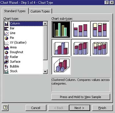
Figure 3
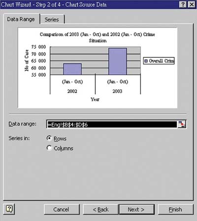
Figure 4
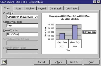
Figure 5
![]()
Figure 6
![]()
Figure 7
(Email address: 'ITB_ForceByte_Editor@police.gov.hk')