
Force Byte
How to create Charts in Excel (2)
Last time, we learned how to create the column chart to illustrate the trend of overall crime rates in Hong Kong. In fact, we can further "fine-tune" it by making use of specific chart options provided. Now let's see what we can do about them.
First of all, we'll go back to the chart we created previously.
Configure "Gridline" Options
The gridlines in the charts make it easy for us to read the "values" of the data. Generally, there are gridlines in the x and y-axis of a chart. But in a three-dimensional chart, we even have gridlines in the z-axis. In our chart, there is only a y-axis that has the (major) gridlines to help us read the overall crime figure for each year.
Now, let's see how we can insert additional minor gridlines to help us better grasp the figures from the y-axis. Place the cursor within the chart and then right click the mouse. When the shortcut menu pops up, choose the "Chart Options" (See Figure 1).
In the "Chart Options" dialogue box, choose the "Gridlines" tab. Then under the "Value (Y) Axis" area, click the "Minor Gridlines" checkbox (See Figure 2).
Lastly, click the "OK" button and the chart turns out to be as follows (See Figure 3).
We'll see that there are additional lines, which are the "Minor Gridlines", between the "Major Gridlines".
Configure "Legend" Options
The legend tells us what category of data is presented in the chart. Place the cursor within the chart and then right click the mouse. When the shortcut menu pops up, choose the "Chart Options". In the "Chart Options" dialogue box, choose the "Legend" tab. Here we can first decide if we would like to "Show Legend". If we click the "Show Legend" checkbox, we can further choose the "Placement" of the legend, i.e. Bottom, Corner, Top, Right and Left (See Figure 4)
Lastly, we just need to click the "OK" button.
Configure "Format Legend" Options
In the legend, right click the mouse. Then choose the "Format Legend" from the shortcut menu to bring up the "Format Legend" dialogue box. There are three tabs ("Patterns", "Font" and "Placement") in this box and I'll explain the options available in each tab below.
1) In the Patterns tab (See Figure 5)
Border:
To set the style, color and shadow for the border of the legend
Area:
To set the color and fill effects for the area within the legend
2) In the Font tab (See Figure 6)
We can change the font, the font style, the font size, the underline style, the font color, the background color, the special effects and the auto scale option here.
3) In the Placement tab (See Figure 7)
We can also position the legend here.
Delete Legend
If we no longer need the legend, we can just delete it by simply selecting the legend and then press the
Next time, I will present you with other chart configurations.
"Sharing IT as it applies to your daily life."
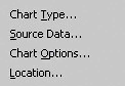
Figure 1
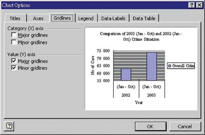
Figure 2
![]()
Figure 3
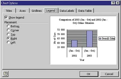
Figure 4
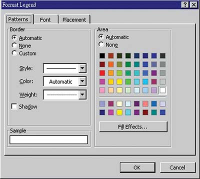
Figure 5
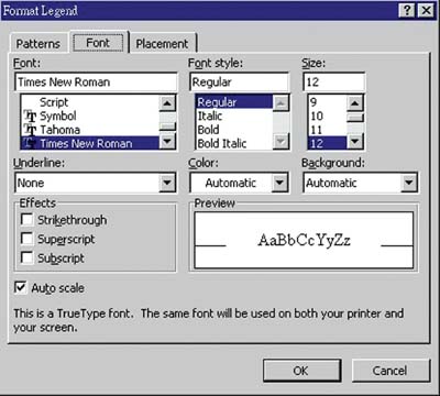
Figure 6
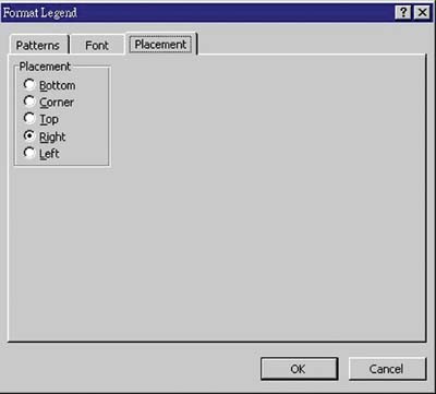
Figure 7
button.
(Email address: 'ITB_ForceByte_Editor@police.gov.hk')